./writing/gearious/landing-page
The Landing Page That Made It Real
In post 03 I mentioned that the second mentor — the designer building a substantial product of her own with these tools — had told me something I needed to hear, and that I was holding it back for this post.
Here it is.
She told me I needed to let go of the pixels.
the advice I didn't want to hear
I would like to tell you I took this advice graciously, internalized it on first hearing, and moved smoothly into a new working mode. That's not what happened.
What happened is that I went home from the lunch where she said it, sat at my desk that evening, opened Figma, and immediately spent ninety minutes designing the marketing-page hero in exactly the way I had always designed marketing-page heros, complete with a type ramp I felt very good about and a hover state on the email-signup button I felt slightly less good about but was prepared to defend in committee.
The defending-in-committee was the tell. There was no committee. There was just me, alone, at a desk on a Tuesday night, defending design decisions to nobody about a page no one had seen yet. Which is — I would now admit — exactly the muscle I needed to learn to stop using.
I have spent my whole career making sure the pixels are right. The craft of aligning every margin and tuning every type ramp is part of what I do, and a meaningful part of why I'm good at what I do. Letting go of it ran against most of my working instincts and, if I'm being honest, against a non-trivial portion of my personality. She was, however, right. The way these tools work — the way the leverage actually flows — depends on the designer becoming closer to an art director than to a pixel-pusher. Describing the voice. Describing the tone. Describing the feel I wanted, the audience I wanted to grab, the emotion I wanted a particular surface to produce. Not the exact margins. Not the exact type scale. The direction, not the deliverable.
I am still learning to do that. It does not come naturally to me. There are days when I close the laptop with twelve open browser tabs of inspiration links and the unshakeable sense that I did not actually do design work — I described design work, which is a different thing that I haven't yet decided how I feel about. The output is good. The output is, in many cases, better than what I would have produced on my own in the time available. But the muscle the designer of 2026 needs is a different muscle than the one I trained for the past quarter-century, and I am training the new one in real time, with the awkwardness that comes from training any new muscle in public.
writing before designing
The way the landing page actually came together, after I got out of my own way, was almost completely backwards from how I had built marketing pages before.
I started with words. Not with a wireframe, not with a moodboard, not with the type ramp I'd been so proud of on Tuesday night. Words. What did I want the page to sound like to a rider who didn't know me? What's the first sentence that would make them stay past the first scroll? What's the one tease, the one detail, the one little moment of recognition that would tell a serious adventure rider this person is one of us, and the product probably is too? What do I want them to walk away with if they only read the headline and the subhead?
The voice work took longer than the visual work would have. That was, also, the point. I went through more revisions of the hero headline than I'd ever done before, in part because the model was patient enough to keep generating alternates as long as I kept asking, and in part because every alternate was making me clearer about what I actually wanted to say. The headline I shipped is the eighth or ninth version. The first version was something defensible and forgettable, like Plan Your Next Adventure. The one I shipped reads like someone who has actually loaded a bike at four in the morning, which is what I wanted, and which is what the page needed to sound like in order to do its job.
Once the voice was where I wanted it, the visuals followed. Not by my hand. By description. I'd describe the feel I wanted — a particular kind of restraint, a particular kind of seriousness, a particular kind of trust me, I've done this register — and the tools would give me back a draft I could push on. Tighter spacing in the hero. Warmer accent color. Fewer feature tiles, more white space. The instructions were at the right altitude. The output was the right output. And the time I was spending in the work was spent on the thinking, not on the nudging-pixels-around.
It was, I will admit, a little uncomfortable. The work felt less like design and more like art direction. That's because it was art direction. The reframe is the whole point.
the working mini-interface
The one feature of the landing page that I most resisted, then most committed to, then was most glad I'd done, was the working mini-interface.
A landing page for a planning app could very reasonably be a marketing page — hero, value proposition, features, testimonials, footer, done. That's the template, the template works, and there's no reason a v1 landing page can't be that. Except.
The fellow adventure riders I wanted to reach are a particular kind of audience. They are skeptical of marketing pages. They've been promised things before. The pattern they trust is show me the thing actually working, even a little bit, and the pattern they don't trust is here's a glossy mockup of the thing I haven't built yet. If I wanted the page to land with my audience, the page needed to prove the thing was real.
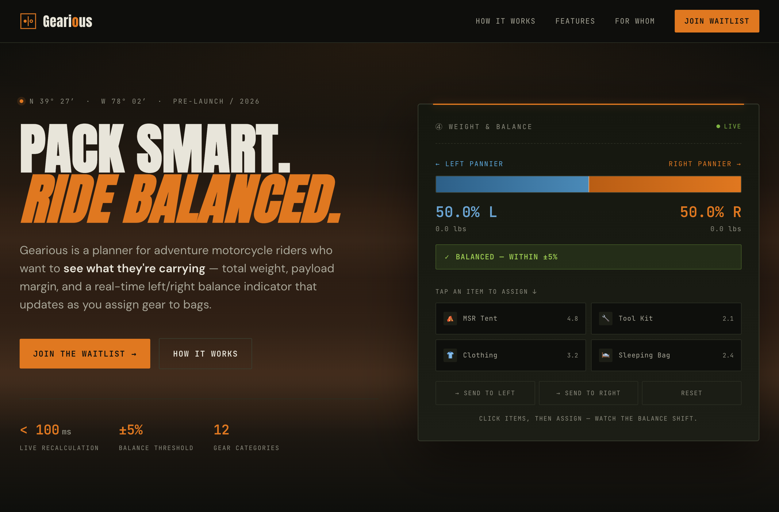
So I built a small, scoped version of the planning experience right into the landing page. Two bags. Three pieces of gear. A balance indicator. A visitor can drag the gear between the bags and watch the balance shift. The first time the indicator turns from amber to green when they get the load balanced, they have felt what Gearious is for, in their hand, on the marketing page, before they've signed up for anything.
The mini-interface cost me many evenings. The hardest part of it wasn't the interaction itself — that's the core mechanic of the whole product, and I already had it working in the prototype. The hardest part was scoping it down. The prototype version has dozens of variables — bag types, gear categories, vehicle profiles, tare weights, the whole architecture. The marketing version needs to be a tenth of that, and every variable I cut had to be cut without making the demo feel like a toy. Toy demos undersell the product. Faithful but-stripped-down demos sell the product. There is a craft to that subtraction that I had underestimated, and the evenings I spent on it were the evenings I learned the most.
It works. It loads in under a second. It gets the point across in about ten seconds of interaction. And it does, I think, more for the page than any amount of static visual polish would have.
the page going live
I want to take a small breath here, because this is the moment in the project that I most want to mark. Fourteen years from the first sketches in a conference-room whiteboard. A decade of opening a folder and putting it back down. The recalibration on the AI tools. The wireframe from ChatGPT. The prompt that took a week to write for Cursor. The foundations week with Claude. Two mentors who picked up the phone. And finally a published page on a public URL, with a small piece of the actual product working inside it, and a place where strangers can land and start to understand what Gearious is for.
Gearious is, as of the publication of this post, A Thing On The Internet — which is, in 2026, the minimum threshold for officially existing. The folder is on a shelf, but it has nothing in it that isn't also on the internet now.
This is a small milestone. It is also the milestone I have been working toward, in some quiet way, for longer than some of the people who'll eventually use the app have been driving cars.
where the project sits, and what's next
This is where the work stands today.
A foundations layer of product, requirements, architecture, and release documents. A working prototype that runs the core planning loop end to end. A published landing page that introduces the product to the world. Two mentors I am still learning from. And a slowly-growing sense of what it means to be a designer who builds — really builds — in 2026.
In future posts I'll share some of the artifacts. The documents themselves, in detail, one at a time. The prompts that worked and the ones that didn't. The landing page interactions in more depth than this post had room for. The architecture decisions I'm second-guessing. The mistakes I'm sure I'm about to make, in real time, where you can watch me make them.
My aim is to design and build out in the open. The reason ideas sit in folders for fourteen years is partly because the tools aren't there yet, and partly because nobody else is showing the work. The tools are here now. The least I can do is show the work.